
Should the Categories Blur?
Snowflake's fifth Modern Marketing Data Stack report sorts the market into thirteen boxes while documenting every force dissolving them.

The Praise and The Contradiction
Picture an AI agent doing the kind of task the fifth edition of Snowflake’s Modern Marketing Data Stack report was written to describe. It reads a stream of behavioural data, scores which customers are worth pursuing, and fires a personalised action into a live channel - one uninterrupted motion, with no pause to ask which part of the org chart it reports to. In the report’s own taxonomy, that single motion has just crossed three separate categories - analytics, activation, and measurement - and noticed the walls between them not at all.

That is the quiet contradiction running through this year’s report, subtitled Governing the Agentic Enterprise and drawn from the usage of more than 11,500 Snowflake customers. On one hand it argues that the marketing stack is collapsing into a governed, composable, agent-driven whole. On the other it divides that whole into thirteen tidy categories, each with a crowned Leader. In one breath it says the walls are coming down; in the next it hands you a floor plan.
The report does its familiar job well, and it is worth reading for that. It measures which technologies customers actually run - usage telemetry, not a survey of stated intentions - and names Leaders and Ones to Watch across identity, analytics, activation, collaboration, and the AI and LLM tooling now threaded through all of them. It is a grounded map of the vendor landscape published each year. But this time the map is the more interesting problem, not the vendors printed on it, well, according to me.
The forces that dissolve the lines
Read what the fifth edition treats as its central themes, and nearly everyone is a solvent for the category lines the report then draws.
Its own framing gives the game away. The defining question, it says, has moved from “which applications are in the stack?” to whether the stack can support coordinated decisioning, governed data access, and controlled automation. That is the report saying that the application is no longer the organising unit - and a category is just a group of similar applications. Retire the application as the unit, and the category loses the thing it was there to organise.
This is a good point.
The forces beneath that shift all pull the same way. Data gravity draws tools toward a single centre, so the same governed data feeds analytics, activation, and measurement without moving - dissolving in practice the separation those categories imply on the page. Composability is described as the new normal, capability assembled from interchangeable parts rather than bought as a bounded product with a clean label. Build-versus-buy is effectively over; organisations now blend what they build with what they buy, smudging the line between a vendor category and an in-house capability until it barely holds. And above all of it sits the agentic theme the report is named for. Scott Brinker, quoted in the edition, puts it well: AI reshaped the stack not by replacing tools but by creating a new control plane above them. A control plane that sits above the tools is, by definition, inside no single category. It spans them all - which is exactly the motion of the agent we started with.
There is the paradox in a sentence. The report’s headline finding is that the stack is converging into a governed, composable, agent-driven whole; its headline deliverable is a diagram that divides that whole into thirteen boxes.
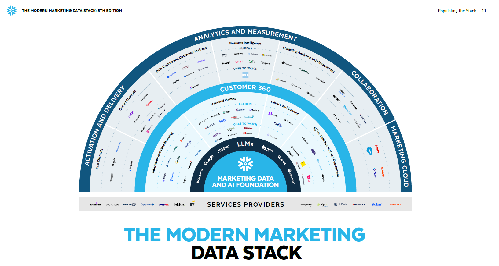
Where the map leaks and why it’s a problem
The clearest evidence that the boundaries are soft comes from inside the report. Acxiom appears this year as a Leader in Identity & Onboarding and, at the same time, a One to Watch in Collaboration - one vendor filed in two boxes at once. It is the map conceding that its own lines are porous, that a serious vendor increasingly does work the taxonomy has to split across headings to describe.
None of this would matter if the categories were only a filing convenience. But categories shape budgets, and the map you buy with becomes the seams in what you build. Run procurement one box at a time - a leader for analytics, a leader for activation, a leader for measurement - and you assemble a stack of category winners that quietly duplicates the same orchestration logic in three places while the coordinated decision that actually matters belongs to none of them. The report half-sees this: it warns that composability without governance creates its own risks, and Deloitte, in its pages, urges organisations to document an AI strategy that at minimum defines what is permissible. That is governance of the connective tissue between categories - and the connective tissue is exactly what a category map cannot show.
The map that is not drawn
There is a second reason the boxes mislead, and it has nothing to do with technology. A category map implies that someone owns each category. In most large organisations someone does - but not in the clean way the map suggests.
I have argued before, borrowing Melvin Conway’s 1968 observation that organisations are constrained to build systems that copy their own communication structures, that your MarTech stack ends up shaped like your org chart. The email team owns the ESP, the paid team the DSP, the data team the platform, loyalty its own engine - four leaders, four budgets, four definitions of the customer. The stack fragments not by accident but because the operating model requires it to, and no CDP, CEP, or decisioning engine unifies a fragmented organisation; each inherits the boundaries already there.
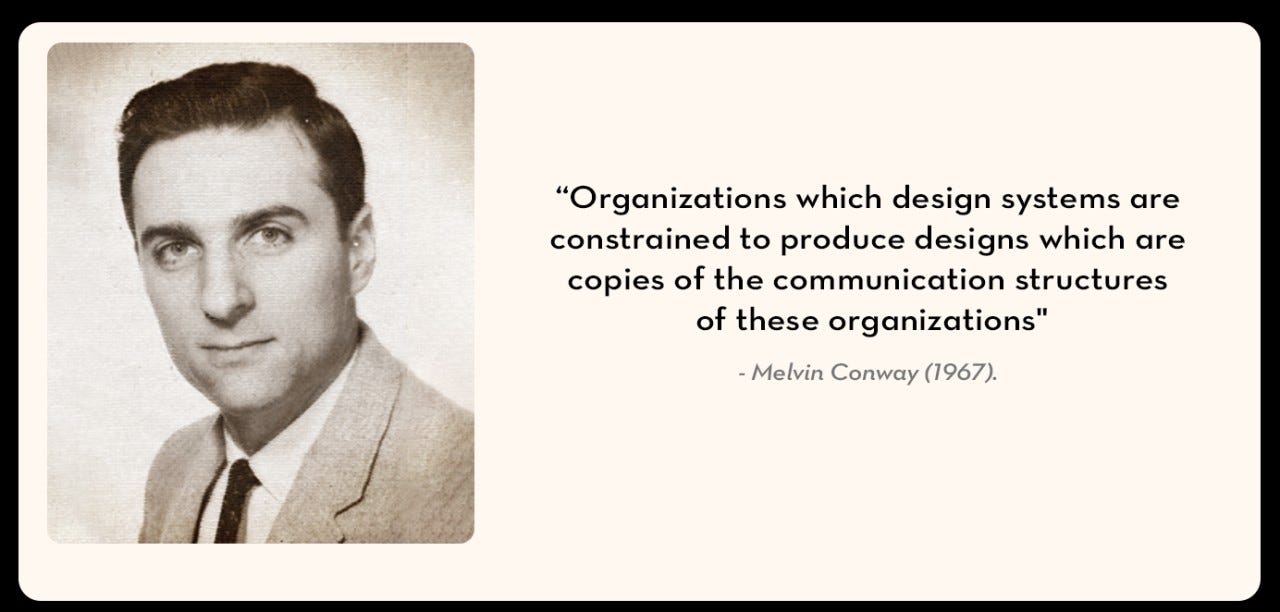
Now lay the report’s thirteen categories over that. They match neither the converging technical flow the report describes nor the org chart - a third geometry, an analyst’s clean abstraction hovering above two messier maps already at odds. And the category map does not sit neutrally over the org chart; it collaborates with it. Hand a fragmented organisation thirteen categories, each with a crowned Leader, and you have handed every siloed team a vendor-blessed shopping list for its own fiefdom. Each purchase is rational inside its box and corrosive across them. Procurement, exactly as Conway predicts, ratifies the boundaries that were already there: you buy your org chart back from vendors, one vendor at a time. The cross-category motion - the agent reading, deciding, and acting across three boxes - belongs to no category and to no executive. The report can describe a control plane above the tools, but nothing sits above the four VPs who's incompatible KPIs that agent is quietly trying to serve at once.
The questions worth sitting with
The categories are not wrong, per se. A map has to draw lines somewhere or it shows you nothing. But it is worth asking what these lines track - and whether they still track it. Why these thirteen, and not some other cut of the same ground? Are the boundaries drawn around the marketer’s workflow, the vendor’s product edge, or an analyst’s need for a chart that fits on one page? When a customer data platform starts orchestrating journeys and an engagement platform starts holding the unified profile, where does one category end and the next begin - and does the buyer ever feel that line, or only the person drawing it?
And the one worth ending on: should the categories blur? Scott Brinker attempted this question onto the old, layered stack when he reframed it as a composable canvas, arguing that fixed layers were a fiction the industry kept drawing out of habit long after the architecture stopped obeying them. The category map may be the next fiction in that line. If data gravity is real, if composability is the norm, if a governing control plane now spans the tools, then the honest picture of the 2026 stack might not be thirteen boxes with a leader in each. It might be drawn around flows rather than products - how data moves, where decisions are made, who governs the action - with vendors falling wherever they touch that motion, sometimes in two boxes at once, sometimes in none.
Snowflake Product Marketing Team has a problem at hand; this is not a convenient way to publish a report. You cannot crown a Leader in a category that is dissolving, and you cannot benchmark a flow as neatly as a box - which may be part of why the boxes hold. But even a better map would not settle it. A category can be redrawn on a page in an afternoon; an org chart cannot. The stack takes the shape of the organisation that buys it, not the diagram that describes it - which is why the report can show a stack converging on the data while the enterprise reading it keeps pulling that same stack apart along the seams of its own operating model. So, the question the fifth edition leaves open is larger than the one it asks. It is not only whether the box is still the shape the stack comes in. It is whether the redrawing that matters were ever going to happen on the diagram at all - or somewhere far more difficult, in the operating model the diagram has been quietly tracing all along.
This essay is the independent analysis of MarTech Square. Snowflake’s Modern Marketing Data Stack 2026: Governing the Agentic Enterprise is available from Snowflake; no vendor has been consulted, reviewed or influenced this commentary.